Case study · Fintech
Harmony Investments: from zero to a fintech ecosystem
Harmony Investments is an early-stage fintech and blockchain investing company that came to Brandtropic with no brand, no website, no app and no systems. We built all four as one system: an isometric H mark in lime and black, a homepage that sells ease, eight app screens and an operations hub on Brandtropic System.
- Client
- Harmony Investments Inc.
- Industry
- Fintech & blockchain investing
- Scope
- Brand · Website · App · Operations
- Services
- Branding, web design, marketing & content and AI systems
The challenge: a fintech with nothing to show for it
Harmony needed an identity that could hold its own in fintech and blockchain: modern, secure and approachable, saying financial freedom, trust and innovation at once. And it needed a presence that could reach investors and users on every platform, in a market where everyone looks the same.
- 01 · No visual identityNothing distinct enough to stand out in a fintech market saturated with the same blues and the same sans-serifs.
- 02 · No digital presenceNo website and no app — nowhere for a first-time investor to land, and nothing to show what the product would feel like to use.
- 03 · No operational backboneClient conversations, passwords and team communication scattered across disconnected tools, with no single home.
The solution: one system, built end to end
We worked closely with the Harmony team on a complete branding and digital design system, built around their goals and their audience.
It started with a geometric logo inspired by the strength and security of blockchain technology, set in a palette of lime green, black and dark gray to signal trust, professionalism and stability.
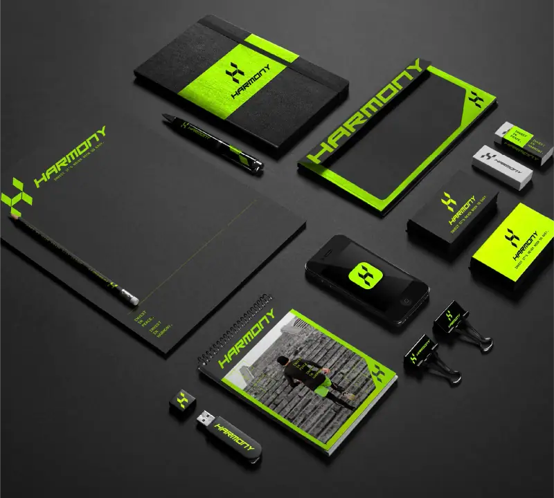
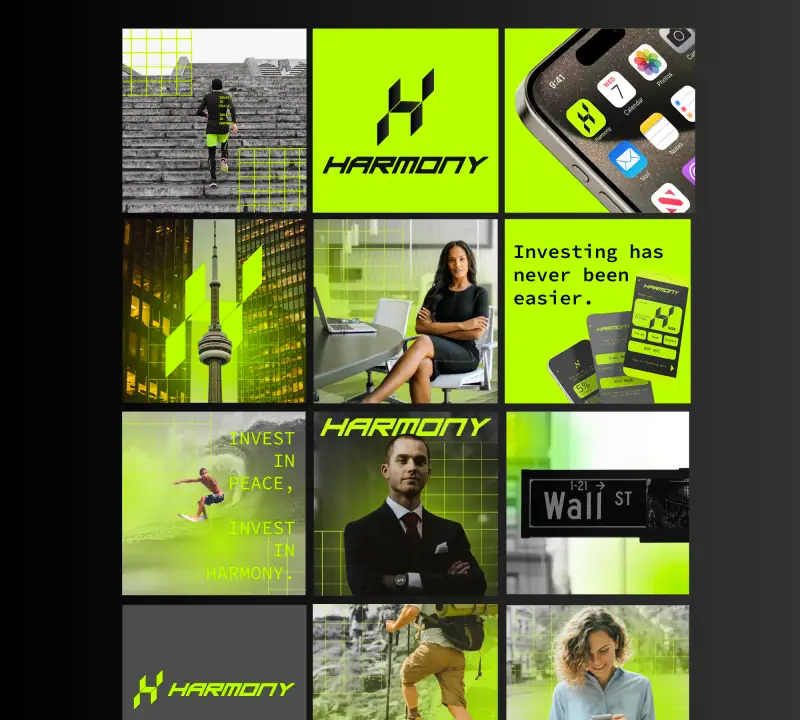
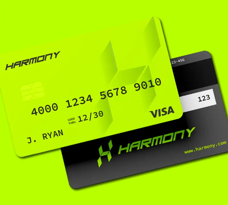
From there it grew into a full brand ecosystem: website design, social media content, advertising graphics, stationery and custom credit card concepts, plus a UX/UI proposal for the future mobile app.
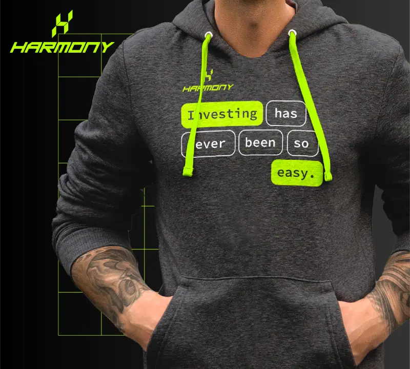
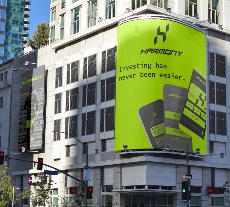
The creative direction rests on one idea: financial freedom. Lifestyle visuals built around surfing, hiking and the outdoors say that Harmony handles your money so you can get on with living. Two lines carry that message wherever the brand appears: “Investing has never been easier” and “Invest in peace, invest in Harmony.”
The identity: a mark built for a phone icon and a building facade
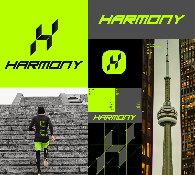
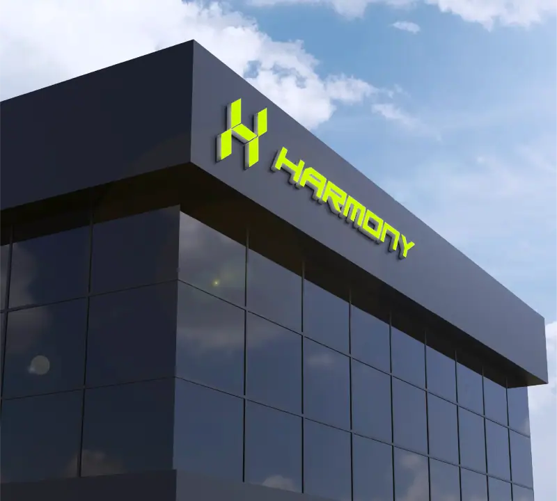
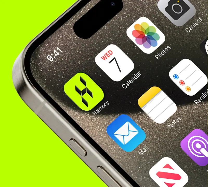
Harmony’s mark is a single isometric “H”, built from flat planes so it reads as a cube from the front and a monogram from the side. It has to work as a 16px favicon and as a lit sign on a building facade without losing legibility at either extreme.
Around it sits an angular, engineered wordmark and a lime-on-black system that reads as fintech rather than “safe corporate blue.” Three colors do all the work, from the stationery to the Instagram grid:
- Lime
#C7FF00 - Graphite
#4D4D4D - Ink
#0A0A0A
The website: a homepage that behaves like the product it sells
The hero puts Harmony’s brand photography — a runner on concrete stairs — under an analysis grid that locks onto the figure like live market analysis, while the headline types itself in right where a ticker would sit on any other fintech screen. Movement and markets in one frame, before a single feature is explained.
Below the fold, the page splits in two for two very different kinds of investor. Easy Mode grows your money toward a target income, no chart-reading required. Pro Mode opens charts, fundamentals and full market depth for the people who want them. Then comes the pitch for the app — one account, every market, on your phone: crypto, gold and equities in the same wallet, the same tap — and a footer that signs off with “Invest in peace, invest in Harmony.”
That is the job of a homepage in our web design work: show how the product feels before listing what it does.

The app: eight screens, one system
The UX/UI proposal for Harmony’s mobile app runs from the splash screen to checkout, and every screen shares the type, spacing and motion rules of the mark. It is a design, not a working app: what the product will feel like, drawn before any code is written.
Launch
A splash screen with the H mark, nothing else.
Onboarding
“How do you want to invest?” Easy Mode or Pro Mode, plus a short investing quiz for the undecided.
Home
Total balance, top up, send and request, and a one-tap way to buy bitcoin.
Menu
Portfolio, markets, activity, learn, payment methods and settings.
Easy Mode
A target and a date, progress toward it, and automatic rebalancing every month.
Pro Mode
Charts from one day to one year, with buy, sell and price alerts one tap away.
Buy BTC
The amount on a keypad, the conversion shown as you type, one button to confirm.
Activity
Purchases, deposits, sales and transfers in a single history.
The operations: everything Harmony runs on, in one dashboard
Built on Brandtropic System: one hub that replaces six disconnected tools — the website, analytics, passwords, client contact, an AI assistant and the team itself.
- WebsiteLive, hosted and monitored. Edit the copy or ship a new section without calling a developer.
- AnalyticsWebsite and app performance in one read, with no separate login.
- Password managerEvery login the business depends on, shared with the right people only — never in a group chat.
- Client chatEvery investor conversation lands here, so nothing gets lost in a personal inbox.
- AI chatbotFirst-line support for common questions, trained on Harmony’s own documents. People handle the rest.
- Team channelsInternal channels for the Harmony team, kept apart from client conversations.
- Meeting roomOne link on the brand’s own domain instead of scattered calendar invites.
- Brand asset creatorSocial posts, ad banners and business cards drafted on brand in seconds. The AI drafts; the team decides.
The results: from zero to a company that looks like one
The numbers below count what was delivered, not traffic or revenue.
- A mark and system confident enough to sit next to any bank or exchange, without borrowing their visual language.
- A homepage that sells the product’s ease before a single feature is explained.
- An app sketched screen by screen in the same type, spacing and motion rules as the mark.
- One operations hub — website, analytics, passwords, chat, AI and the team — instead of six logins.
- 1Identity system applied everywhere, from favicon to building signage
- 8App screens designed in one shared visual language
- 6Disconnected tools replaced by a single operations hub
- 0Seams left between brand, site, app and operations
Questions about this project
Straight answers, no runaround.
Who designed the Harmony Investments brand?
Brandtropic, a remote branding agency based in Tijuana and working on Pacific Time, designed it end to end: the isometric H mark, the lime, graphite and ink palette, the website, the app screens and the operations hub the team runs on.
Did Brandtropic build the Harmony app?
We designed it. The app is a UX/UI proposal of eight screens, from the splash screen to checkout and activity history, drawn with the same type, spacing and motion rules as the mark. It shows what the product feels like before any code is written.
Can Brandtropic do the same for my fintech startup?
Yes. Brand, website, app design and systems can run as one project or in stages. Every project is quoted in three tiers — Basic, Mid and Heavy — with a clear proposal before you commit, and US clients are invoiced in USD. A brand identity usually takes three to five weeks.
This is what “from zero” looks like when one team builds it all.
Brand, website, app design and the operations system, made by Brandtropic end to end for a client that started with nothing. Tell us where your business is, and we reply with a first read of your case and a clear proposal. No commitment.